Functions for easily making publication-quality figures with matplotlib.

Overview

Data-viz utils 📈

Functions for data visualization in matplotlib

📚 API

Can be installed using pip install dvu and then imported with import dvu.

You can also just copy the relatively short source code for the functions (easily viewable here).

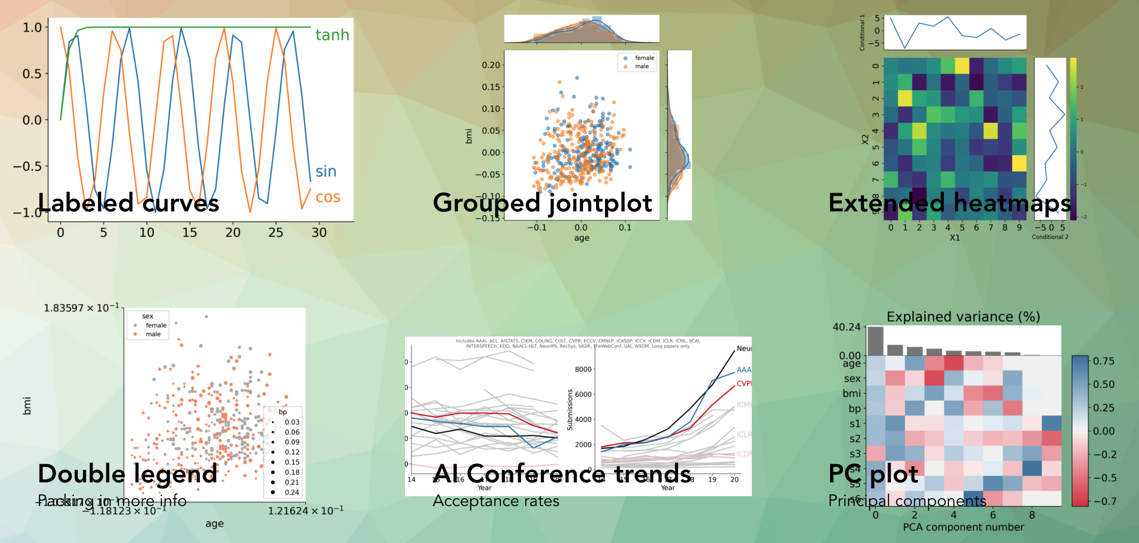
Helps create a bunch of different plots such as these:

One particularly useful function is dvu.line_legend() which replaces a typical matplotlib legend with labels for each line:

Using plt.legend() Using dvu.line_legend()
plt_legend dvu_legend

Another one is dvu.invert_plot() which can be called after generating a plot to invert everything besides the line colors

Original plot After dvu.invert_plot()
plt_legend dvu_legend

Reference

Owner
Chandan Singh
Working on interpretable machine learning across domains 🧠⚕️🦠 Let's do good with models.
Chandan Singh
Plot and save the ground truth and predicted results of human 3.6 M and CMU mocap dataset.

Visualization-of-Human3.6M-Dataset Plot and save the ground truth and predicted results of human 3.6 M and CMU mocap dataset. human-motion-prediction

Gaurav Kumar Yadav 5 Nov 18, 2022
A curated list of awesome Dash (plotly) resources

Awesome Dash A curated list of awesome Dash (plotly) resources Dash is a productive Python framework for building web applications. Written on top of

Luke Singham 1.7k Dec 26, 2022
Bcc2telegraf: An integration that sends ebpf-based bcc histogram metrics to telegraf daemon

bcc2telegraf bcc2telegraf is an integration that sends ebpf-based bcc histogram

Peter Bobrov 2 Feb 17, 2022
Editor and Presenter for Manim Generated Content.

Editor and Presenter for Manim Generated Content. Take a look at the Working Example. More information can be found on the documentation. These Browse

Manim Community 149 Dec 29, 2022
Make scripted visualizations in blender

Scripted visualizations in blender The goal of this project is to script 3D scientific visualizations using blender. To achieve this, we aim to bring

Praneeth Namburi 10 Jun 01, 2022
Epagneul is a tool to visualize and investigate windows event logs

epagneul Epagneul is a tool to visualize and investigate windows event logs. Dep

jurelou 190 Dec 13, 2022
A declarative (epi)genomics visualization library for Python

gos is a declarative (epi)genomics visualization library for Python. It is built on top of the Gosling JSON specification, providing a simplified interface for authoring interactive genomic visualiza

Gosling 107 Dec 14, 2022
Datapane is the easiest way to create data science reports from Python.

Datapane Teams | Documentation | API Docs | Changelog | Twitter | Blog Share interactive plots and data in 3 lines of Python. Datapane is a Python lib

Datapane 744 Jan 06, 2023
A concise grammar of interactive graphics, built on Vega.

Vega-Lite Vega-Lite provides a higher-level grammar for visual analysis that generates complete Vega specifications. You can find more details, docume

Vega 4k Jan 08, 2023
Simple Inkscape Scripting

Simple Inkscape Scripting Description In the Inkscape vector-drawing program, how would you go about drawing 100 diamonds, each with a random color an

Scott Pakin 140 Dec 27, 2022
a simple REPL display lib for circuitpython

Circuitpython-termio-lib a simple REPL display lib for circuitpython Fonctions cls clear terminal screen and set cursor on top left : coords 0,0 usage

BeBoXoS 1 Nov 17, 2021
Customizing Visual Styles in Plotly

Customizing Visual Styles in Plotly Code for a workshop originally developed for an Unconference session during the Outlier Conference hosted by Data

Data Design Dimension 9 Aug 03, 2022
Plot-configurations for scientific publications, purely based on matplotlib

TUEplots Plot-configurations for scientific publications, purely based on matplotlib. Usage Please have a look at the examples in the example/ directo

Nicholas Krämer 487 Jan 08, 2023
Data Analysis: Data Visualization of Airlines

Data Analysis: Data Visualization of Airlines Anderson Cruz | London-UK | Linkedin | Nowa Capital Project: Traffic Airlines Airline Reporting Carrier

Anderson Cruz 1 Feb 10, 2022
This tool is designed to help administrators get an overview of their Active Directory structure.

This tool is designed to help administrators get an overview of their Active Directory structure. In the group view you can see all elements of an AD (OU, USER, GROUPS, COMPUTERS etc.). In the user v

deexno 2 Oct 30, 2022
A simple python script using Numpy and Matplotlib library to plot a Mohr's Circle when given a two-dimensional state of stress.

Mohr's Circle Calculator This is a really small personal project done for Department of Civil Engineering, Delhi Technological University (formerly, D

Agyeya Mishra 0 Jul 17, 2021
Arras.io Highest Scores Over Time Bar Chart Race

Arras.io Highest Scores Over Time Bar Chart Race This repo contains a python script (make_racing_bar_chart.py) that can generate a csv file which can

Road 2 Jan 16, 2022
A little word cloud generator in Python

Linux macOS Windows PyPI word_cloud A little word cloud generator in Python. Read more about it on the blog post or the website. The code is tested ag

Andreas Mueller 9.2k Dec 30, 2022
Python Data Validation for Humans™.

validators Python data validation for Humans. Python has all kinds of data validation tools, but every one of them seems to require defining a schema

Konsta Vesterinen 670 Jan 09, 2023
Handout for the tutorial "Creating publication-quality figures with matplotlib"

Handout for the tutorial "Creating publication-quality figures with matplotlib"

JB Mouret 1.9k Jan 02, 2023